August 16, 2023
Type with purpose: Fonts that tell stories
Est. Read time Min.
Typography and fonts have been on my mind a lot recently. I had a great chat with a fellow business owner who mentioned they’d been using my posts to create their brand. They commented on medium asking for some examples of fonts they could use aside from the ones I mentioned in my Understanding & Type post. While I can’t really recommend specific fonts for people’s projects without having insight into what they value and what they want to communicate and where they place the different tradeoffs between design and their values, it did get me thinking on some purposeful fonts with pretty cool stories.
Gilbert: A font for inclusion and celebration.
I’ve been talking a lot about digital accessibility and WCAG lately, it’s a passion of mine. But there are so many sides to access and inclusion beyond disability, that this time around I wanted to highlight something else. I want to talk about pride and the celebration of queer identities, ang Gilbert is the perfect font to tell that story.
If there’s a font that throws confetti in the air and shouts “celebrate who you are,” it’s Gilbert. Named after Gilbert Baker, the creator of the iconic Rainbow Flag, this font was designed as a tribute after his passing in 2017.
With standard, color and animated versions, this is not just a collection of letters; it’s a parade in text form. You can find the font for download under a Creative Commons License at typewithpride.com.
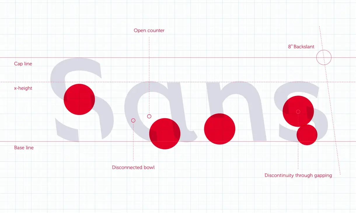
Sans Forgetica: A counterintuitive road to truth.
In design, we always focus on ease of interaction. We try to make experiences as intuitive and frictionless as possible, helping our audiences get where they want to go without making them think. But there can be a downside to that frictionless interaction which makes us act on autopilot and not truly engage with the information we are receiving.
With this in mind, researchers at RMIT University in Australia designed the font Sans Forgetica. Following a principle known as disfluency they hypothesized that by making a font somewhat more difficult to read, we would be taken out of autopilot and improve our understanding and recall.
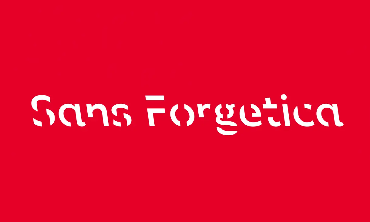
The creators put their font to the test with hundreds of students in Australia with positive results, but other researchers weren’t able to reproduce these results and even reached contradictory findings, leading to the font being taken down. However, you can still find the original press release and video explaining the science behind Forgetica Sans on the site of RMIT University.
Interestingly, new research has been looking into the principle of disfluency, not for helping us study better and remember what we read, but as a way to break up the automated reading and help us judge the information receiving with our full attention. This effect might be a valuable weapon to combat the spread of misinformation and fake news, since we are prompted to evaluate more carefully the information we read in social media.
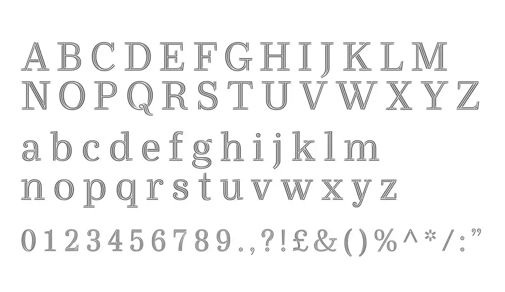
Ryman Eco: The real-world impact of typography
I have mentioned before that I focus primarily on digital spaces. It has been many years since I designed for print but one thing I always want to bring attention to in my work, is that our digital presence has analogue effects. I recently realized in horror that my slide presentations, which I always create in dark mode to help with readability in rooms where the light is not ideal, are being printed by some students and professors for note taking, causing some serious waste of printer ink. Digital and physical spaces are not separate from one another, and decisions we make on-line can have serious impact in the off-line work.
This is why I really appreciate the Ryman Eco font and what they are trying to achieve. The font is the brainchild of UK stationery retailer Ryman and Monotype Type Director Dan Rhatigan, along with Grey London. This isn’t just another font; it’s a statement in sustainability. With its design, the font manages to shave off an average of 33% ink usage compared to standard fonts like Arial or Times New Roman.
The beauty of Ryman Eco lies in its clever design, which plays with ink bleed and toner spill. At smaller sizes, the small lines of each character merge because of ink bleed, resulting in high legibility. In larger sizes and on screen, these channels become a beautiful style statement.
Why does this matter? Over 65 million printer cartridges are sold annually in the UK alone, and a staggering 1.5 billion worldwide. These cartridges are filled with materials that are tough on our environment, taking centuries to decompose. You can find the beautiful font to download for free, along with more information on the project and a beautiful collection of posters at rymaneco.com.
XXZ: Championing Privacy and security in type
Created by artist Sang Mun, ZXX is named after the United States Library of Congress code for “No linguistic content”, and its disruptive design was created with the intention of being unreadable by OCR text scanning software, as a form of protest against the invasions of privacy perpetuated by the NSA in the U.S..
The concept of ZXX was born from Mun’s reaction to the leaks providing insights into the depths of surveillance and privacy invasion by the NSA. According to an article in walkerart, the font is his response to the growing concerns around digital privacy, a creative stand against the invasive nature of modern technology. Although the original site has since been taken down, the font and its variations are still available on GitHub.
In ZXX, each letterform is crafted to confuse text-scanning systems, effectively making the text disappear to digital surveillance tools. The font offers different styles – each one designed to obscure the text in a different way, making it unreadable by machines while still somewhat legible to the human eye. It’s a blend of art and functionality, a typeface that speaks more about what it hides than what it shows. A subtle act of defiance, a way to keep communications private in a world that’s constantly watching.
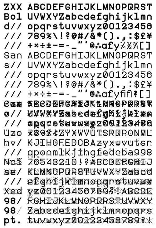
The font itself is not only unreadable by text scanning software, it is also pretty damn difficult for humans to read and I would advise caution in applying it anywhere that requires comprehension and clarity. But that’s kind of the point, while ZXX might not be practical for everyday use, it is a symbol of the importance of privacy in our digital lives. ZXX is not meant to be a solution to the surveillance problem, but way to bring attention and challenge this reality, to be a reminder of the need to be aware of the digital footprints we leave and the potential for technology to intrude upon our personal spaces.
Maggie: An experimental font giving back to a good cause
Every year an event called “36 Days of Type” takes place where designers, artists and illustrators are invited to create on the letters of the Latin alphabet and numbers, sequentially over 36 days. This year, one of the participants in the event was Tasos Varipatis, a senior type designer at The Northern Block. Through their participation in this experiment, the font Maggie came to be.
Maggy defies traditional typography norms by seamlessly blending various styles while maintaining a harmonious balance is deeply influenced by Dadaism, Deconstructivist architecture, and Wabi-Sabi, making it a bold exploration of typographic design boundaries.
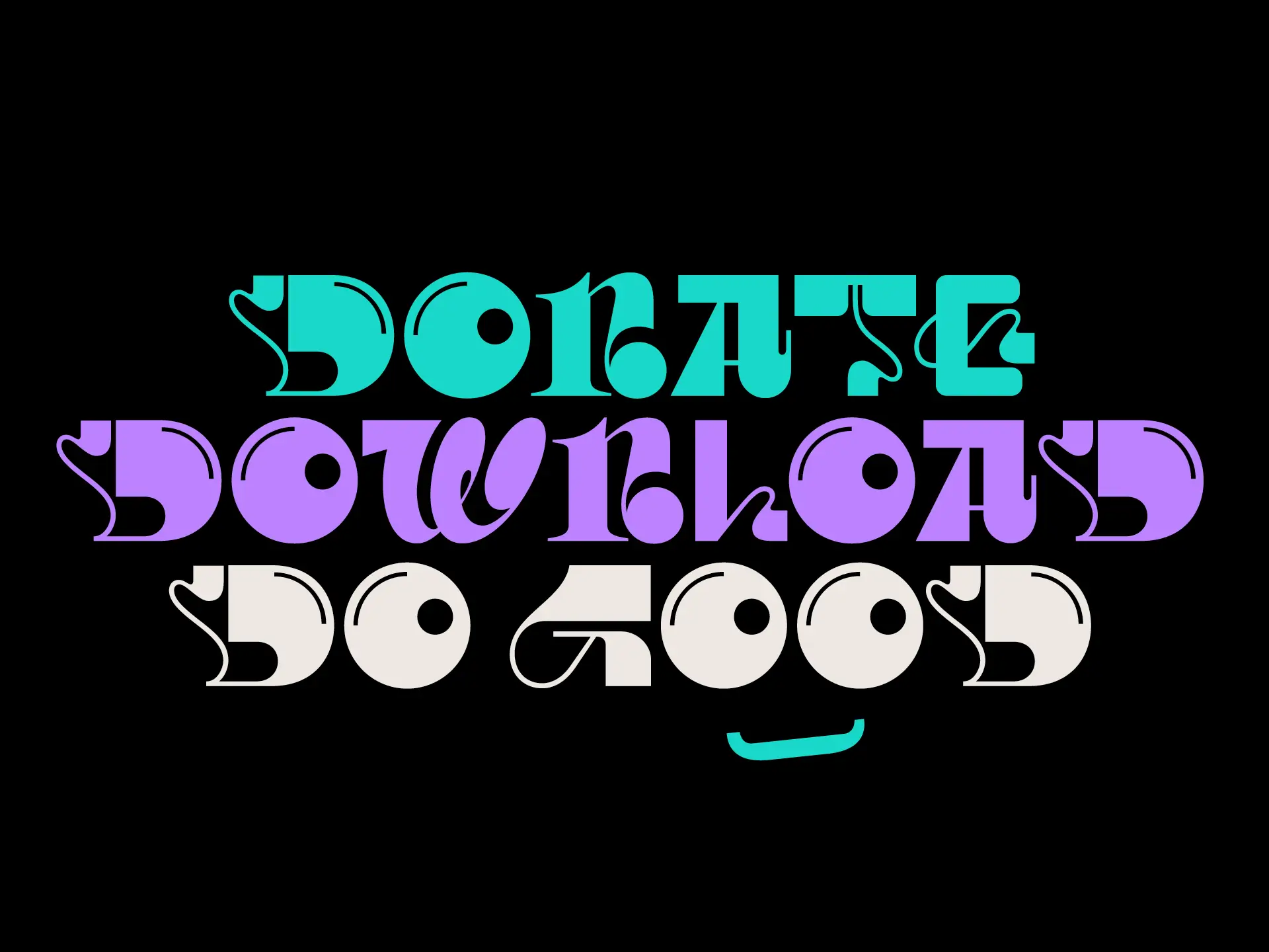
But Maggy is more than just a typeface; it’s a cause. The Northern Block has committed to donating all proceeds from the sale of the Maggy typeface to support Maggie’s, a charity providing free cancer support and information. This initiative was born from the personal experiences of The Northern Block’s Head of Brand, Donna Wearmouth, and reflects the team’s belief in using design as a powerful tool for positive impact.
The typeface is available exclusively from The Northern Block’s website, with all proceeds going to support Maggie’s centers in Newcastle upon Tyne.
Reflecting on these fonts, each with its own unique story and cause, it’s clear that typography does more than just convey words; it carries with it values, stories, and far-reaching impact. From Gilbert’s vibrant embrace of diversity to Sans Forgetica’s mind-engaging design, Ryman Eco’s resource-saving approach, ZXX’s stand for privacy, and Maggy’s charitable cause, each font demonstrates how our choice in typeface can extend beyond aesthetics to meaningful action.
As we choose our fonts, we should remember we’re also choosing the stories we want to tell and the impact we want to have in the world. It’s not just about the type; it’s about the purpose behind it.