When building your brand and choosing your brand colors, considering accessibility might strike you as a limit to your creativity, but the fact of the matter is that you can have your cake and eat it too. You can have a beautiful color story, you can stick to your brand identity, you can be green and yellow and blue and any color you can think of.
Contrast is one of the biggest issues for color and accessibility. Having adequate contrast will make your designs legible for users with disabilities and users without them alike. If you’ve ever tried to read a website on your phone in broad daylight, you probably know the struggles of low contrast text.
Luckily, contrast is one of those concepts we’ve all heard about, and even luckier it’s something that is easy to measure and a simple check of the contrast ratio will let you know if your design will be readable if people are outside checking it out on a phone screen on a sunny day, if they have 20/40 vision – which is very common in all people as we get older – or if they have a form of color blindness.
The WCAG, is the set of accessibility guidelines that establishes best practices for accessibility and they tell us that the bare minimum of contrast our design should have is 3:1, a good one is 4.5:1 and the goal to strive for is 7:1. The recommendations include different minimum ratios depending on the size of your text, smaller text will need more contrast to be legible than bigger text.
To sum up, the best rule of thumb is to give all of your text a contrast ratio of at least 3:1 (and, ideally, 4.5:1 or greater) to make it accessible to people with vision impairments, as well as make it more readable for everybody.
Your new best friends
If you’re wondering how would you ever even know whether your color choices are accessible, especially if you don’t have one of the various forms of color blindness, there are several tools of the trade that come to the rescue:
- Software like Photoshop and Illustrator have color blindness filters that let you have a look at your design and figure out if it still conveys the meaning you originally intended.
- Online contrast tools like Contrast Checker.com, and WebAIM.
- Safe color finders like Color Safe can help you start your visual brand identity with accessible palettes.
- Overall accessibility tools like WAVE can help you get started with the many accessibility checks.
When choosing my brand colors and the color palettes for my clients, I use the accessible color matrix to see how my colors interact with one another and which applications and combinations I can use.
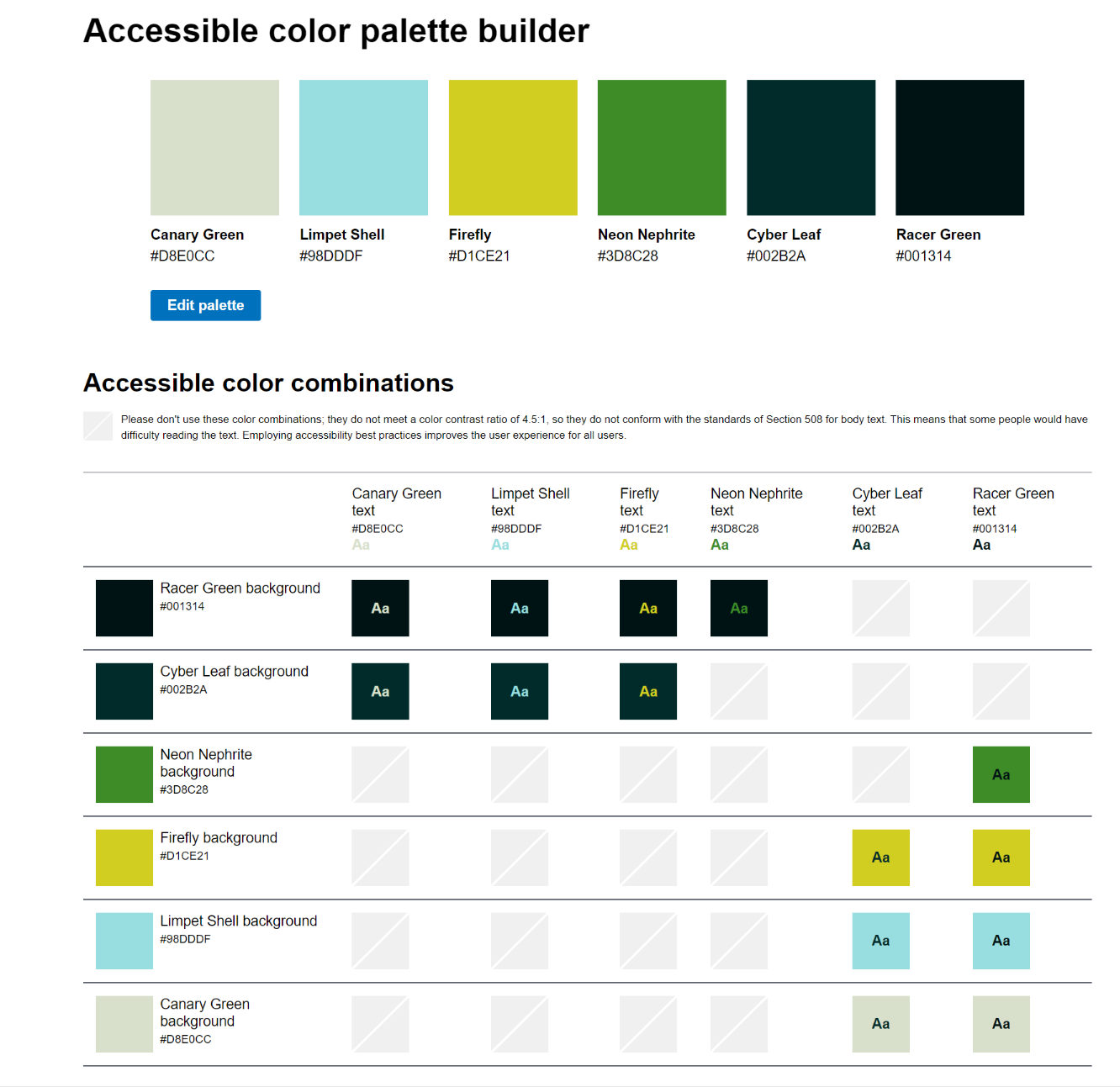
Thanks to this matrix I can know to stick to Canary Green and Limpet Shell text over or as a background for my Racer green or Cyber Leaf colors and that my Sulfur color only has sufficient contrast when paired with the dark shades, never with light. This allows me to design collateral where the contrast is always high enough for comfortable reading, with black text on white, white text on black and having accent colors to go with either.
Just remember, no automated resource can do better than you and your common sense, so use them wisely.