Back in the day when I first started school, full color printing was pretty expensive, and in the time before Facebook (yes, I know, I’m ancient… moving on) digital only design wouldn’t cut it at all. I remember one of my professors repeating over and over, “If your logo design doesn’t work in just black ink, it’s useless”.
Nowadays, full color laser printing is ubiquitous, and designing for screens is the bread and butter for every designer. We use beautiful gradients and halftones, incredibly precise hex codes that give us any color combination imaginable, and high-resolution monitors give us images that appear more vivid than the real-world objects in front of us.
How easy would it be to think that my old professor’s words are irrelevant today, just an artefact of older times when things were completely different? And yet they still hold true; not because sometimes we will have to choose to print design in one ink only to save up on some money (which in some situations, it’s totally still the case), but because if we rely solely on color to be the only affordance for our design, we are failing to communicate with a significant portion of our audience.
Color is a powerful tool that affords seemingly endless design possibilities, but far too many of us design with only one type of color vision in mind—our own.
Geri Coady, Color Accessibility Workflows
Color as meaning
Considering different color vision doesn’t mean you don’t use color to convey meaning, it is a fantastic tool to do so, it just means you know better than to use color as the only tool to convey meaning the meaning or the affordances of your design.
Forms, charts, buttons and graphs are the most common places where the inattentive designer can forget that the way they perceive color is not universal. When the approximately 5% of people worldwide who have a color blindness come to read your chart and see two identical lines moving in opposite directions, or a whole pie where every piece looks exactly the same, they won’t stick around to figure out what you’re trying to say to them. If I can’t tell which of the fields in your checkout form has an error, I’ll probably just leave the shopping cart and go some place else.
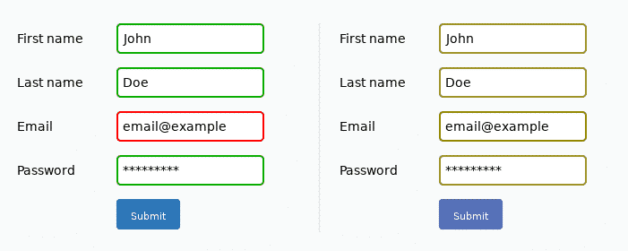
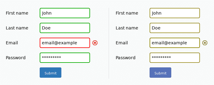
But here’s the good news, adding text, texture or shapes is easy, free and doesn’t significantly alter your design in any other way, as described by these images from Jonas Jared Jacek’s article on the WCAG and web accessibility (Opens in a new tab).
Living with a partner with color blindness has made it very easy for me to consider different color visions when designing interfaces. It’s very easy to ask for his help with usability testing and see where he has trouble and where how he would prefer to experience a design. But there are several other tools like the A11y color blindness empathy extension for chrome,(Opens in a new tab) which lets me see my design as people with different color visions see it, and decide if the design still makes sense when I remove the meaning.
Video Description: A screen capture of my website in the Brave browser, activating the A11y color blindness empathy extension and going through all the different options to show how the color of my fonts changes every time and how even if the color in my buttons stops being visible, the changes in size help show when the button is being hovered and that it is a clickable element.
Another element of websites where often color is the sole affordance is button hover states. If the only sign that a person is hovering a button is a slight change of shade, a significant portion of your users cannot experience it. You can play with contrast, size and movement to convey the meaning, like I do with my call to action buttons.
My invitation, in sum, is for you to take the challenge of color head on. To consider different color vision, meaning and affordances and to enrich your design and user experience with the use of other tools like size, contrast, shape and movement as elements of meaning.