April 5, 2023
Quick checks for accessibility in type
Est. Read time Min.
A while back I wrote a post about the role of typography in accessibility. Part of the article was about selecting the right fonts to represent your brand and how the most accessible and legible fonts focus on availability, familiarity and simplicity.
With the incredibly large amount of fonts available online, free and premium, and in a very broad spectrum of quality, some people have asked me for some more guidance on knowing if a specific font is accessible. And while I can’t really produce a comprehensive list of available fonts and their different accessibility levels, I can share a couple of quick checks you can run on your font choice to check for legibility.
These checks will help you evaluate a font you want to use for your brand and communications. They refer to elements of type design that we as users have little or no control about, so by checking these out we can learn how the designer approached the creation of the font, in many cases they help us gauge the quality of the font, and whether or not it will be legible to our audiences.
There is no scorecard, and common sense needs to be your primary guide in this but, in decreasing order, these checks show you red flags about your font selection.
10 Quick Checks
1. The “is it even a font?” check
Ever stumbled upon a social media post that’s packed with quirky characters and symbols? Welcome to the world of Unicode fonts—those creative text styles that have flooded our feeds and timelines. Some people think they look good and reflect their unique personality and style, but there is a catch: they’re a nightmare when it comes to accessibility.
The first problem is that Unicode fonts aren’t really fonts. They’re sets of special characters that often don’t support the full range of alphabets, numbers, and symbols. For anyone using a screen reader their assistive technology will struggle to interpret and vocalize this text correctly.
Additionally, these special characters can look unfamiliar or confusing, making them very hard to read for people with cognitive or visual impairments. They’re even hard for people with perfect vision. Imagine trying to read a sentence where every letter has been replaced with a mathematical symbol or ancient Greek letter. It’s not just about aesthetics; it can genuinely make content inaccessible.
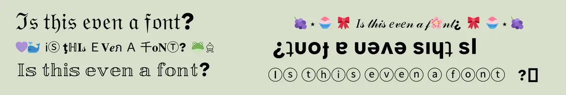
So, before you end up using one of these “trendy” Unicode fonts, remember that they can exclude a large chunk of your audience.
2. The fancy check
In the past 5 years or so there has been a resurgence of script fonts in branding. When I talk about script fonts I’m talking about those that try to mimic cursive handwriting. They’re particularly popular in women owned businesses, and they’ve become a shortcut for communicating “soft and feminine” in your branding.
Aesthetic preferences aside, these “fancy” script fonts, alongside decorative fonts, horror fonts, 3D fonts, graffiti fonts, and brush fonts can produce a host of issues for people who are trying to read your content online. Used sparingly and for decorative text, they can give an extra umph to a website without having to rely on images or graphics, legibility of these fonts is significantly reduced.
Fonts with lots of flourishes or intricate details might look great on a wedding invitation but can make everyday reading difficult. In fact, highly embellished fonts can also be problematic for those without any visual difficulties, as they often require more cognitive effort to read and understand. If your text is meant to be quickly scanned or easily readable—which is often the case in our fast-paced digital world—these ‘fancy’ fonts can be more of a hindrance than a help.

So it comes down to asking yourself, what are your priorities in your digital presence? Do you value more being read and understood? Is it more important to give a specific vibe? How do you prioritize the needs of your audience? Is your design helping you meet your conversion goals?
3. Special characters check
Does your font have all the components you actually need? Many fonts are lacking when it comes to a full set of numbers, symbols, or even accented characters. If your audience is global, or you’re naming specific people or places, this can be a real deal-breaker.
Imagine trying to spell the name of a collaborator from another country but finding out your chosen font doesn’t include accented characters. Or trying to communicate something that requires special symbols. Skipping this check can make you unintentionally exclusionary, especially towards people with non-Western names or in languages with unique characters.
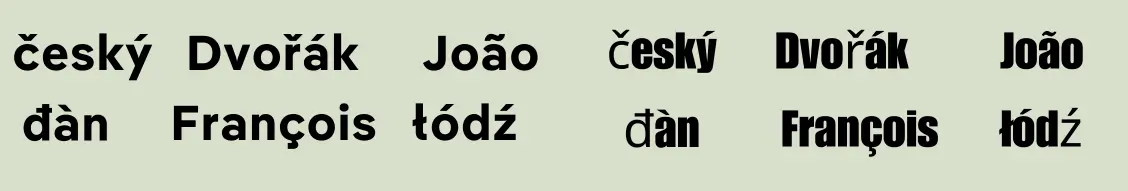
Special characters at this point aren’t really just a ‘nice-to-have’ they are a ‘must-have’ for making your content accessible and inclusive to a diverse audience.
4. The weight check
Font weight isn’t just about aesthetics; it’s critical readability and accessibility. Fonts with a thin weight may look sleek and modern but can be hard to read, especially for people with low vision. Thin fonts also often lack the necessary contrast against a background, making them difficult to discern in various lighting conditions or on different devices.
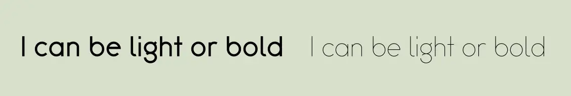
Choosing a font that offers multiple font weights, from light to bold, gives you flexibility and allows you to emphasize text where needed and improve overall legibility. If your font doesn’t give you a range of options in terms of weight, at least you can make sure that the default weight is enough to give you good contrast and legibility with your background.
5. The contrast check
By now, I’m sure you know how important contrast is for accessibility and for legibility in general. We’ve talked about color contrast and in the previous point we were checking if a font has enough weight to give us contrast with its background. But there is another important type of contrast in font design that we can’t control, the contrast between the strokes of the character.
When we read text, a lot of what goes on in our brains is a matter of shape recognition, so the contrast between all the different components of a character help make its shape identifiable. But too much contrast can cause a lot of problems with how legible a font is.
Some of my favorite fonts, like Bodoni, are absolutely stunning and impactful on a one-word header or a name. They make for beautiful logos but overall, they give a terrible experience when used in body copy.

6. The all caps check
Another important check to do with the font you want to use to represent your brand is whether it’s an all caps font. By this I mean that you can only set the text in all caps and there is no lowercase option. All caps text is a heated debate among type enthusiasts, with opinions ranging from “It looks like you’re yelling the whole time” to “I need my CTAs to POP”. When facing conflicting opinions, I go to the data, which in this case is… also conflicting.
Several experiments have shown that all caps text is harder to read because of what we mentioned on the previous point: we read by recognizing shapes. If a whole word looks like an even rectangle it’s harder to identify which letters are part of it. But other experiments, like one conducted by Nielsen has shown that for key words where you need to glance and catch the word really quickly, all caps are better. So as usual the answer is nuanced.
You might want to use all caps for your key CTAs or other elements of the page where you want people to find the information in one quick glance. You want to avoid writing whole sentences or body text in all caps. Since you need this versatility, you want to make sure your font can give you options, or at least know ahead of time that you will need an additional font for longer texts which can increase distraction and use of resources on your site.
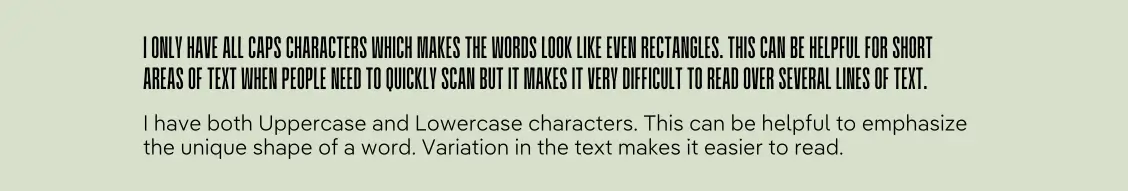
This check is helpful to make sure your font can give you all the versatility you need to use it in all the different situations where you might need it. And please, no matter which font you choose, don’t write text that you want in all caps in actual all caps in your keyboard, they often end up being read as an acronym (letter by letter) by screen readers and I don’t have to tell you how annoying it is to sit there through a whole sentence being announced one letter at a time.
7. The Il1 check
Legibility in text is all about pattern recognition, so you want to make sure that your fonts, specially sans-serif fonts have distinct and unique shapes that help people recognize them easily. This is where the Il1 check comes in.
A legible typeface should have unique shapes for all characters, while others might have what some people call imposters; two or more characters that look exactly the same. Imposters lead to a lot of issues with legibility that you really want to avoid.

While a font might have any number of imposters, the ones that are most commonly an issue are those in the Il1 check, making it a quick shortcut to get an idea of the whole font. When you are testing out your font, you can type a capital i a lowercase l and the number 1 to see how distinct these characters are. Other characters worth looking at to identify imposters are the uppercase o, the 0 and the Q. These are often hard to tell apart and can make for confusing text.
8. The coe check
The c, o, and e characters are some of the most commonly used in the English language, but in some fonts, these letters can blend together, especially at smaller sizes. The coe check lets us see the aperture of our fonts, which is the opening on the right hand side of the c and the e to make sure these characters are distinct from one another.

In general, want to choose fonts with wider openings in these characters, because it will help readers differentiate them even in smaller font sizes.
9. The db qp check
Mirroring can also be a problem for people with dyslexia and other reading difficulties, when characters look exactly like a mirrored version of another character they can be easily confused.
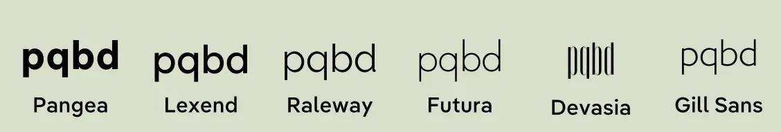
Choosing fonts like Raleway, that have distinct characters for b and d and p and q will go a long way in helping your users with the legibility of your text.
10. The x check
The x-height is a common typography term that refers, unsurprisingly, to the height of the letter x. Fonts with higher x-heights are usually easier to read than those with smaller ones, but be careful that the distance between the ex height and the top of your capital letters, known as cap-height, is enough that they don’t get easily confused.
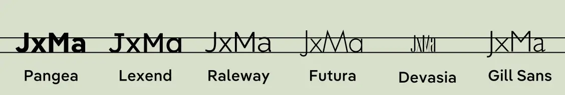
And while you’re at it, have a check of the uppercase J, more legible fonts have designed this letter in a way that the bottom of the J doesn’t go lower than the base of the x.
Wrapping It Up
So there you have it, folks—a quick rundown of tests to help you figure out if a font is easy on the eyes and accessible to everyone. But remember, picking the right font is only half the battle. How you use it also makes a big difference. These checks are about the stuff we can’t really tweak after we pick a font. Stay tuned, though. I’ll be back soon with another post to dive into the things we can actually control to make our text even more reader-friendly.